NanoKard Website
Strategize and write end-to-end content for a full website.
Shipped Aug 2024
6+ months
This document serves as a condensed version of a comprehensive case study focused on user experience design improvements. For access to the full case study, please send an email request to Jecatam@icloud.com for password access.
In early 2024, NanoKard launched new payment solutions for businesses and customers in response to changes within a niche industry that reduced processing volumes for acquiring businesses. This led to a renewed focus on developing a website to showcase NanoKard’s features, educate users, and attract new customers with comprehensive information.
Discovery & define
During user testing and content auditing of the previous website, we found that there was a lack of clear and accurate information for both businesses and customers regarding the product.
The main issues identified were:
Businesses and customers struggled to understand how to use the product, as there were no help center articles available to assist them in setting up and using their accounts.
Attracting new businesses and customers was challenging due to a landing page that failed to provide clear and accurate information.
The website appeared untrustworthy and outdated.
The landing page did not align with the business goals or reflect the company's values.
Strategy & exploration
I started by strategizing with stakeholders about what information was needed to sell this product, where users were typically confused or lacked information.
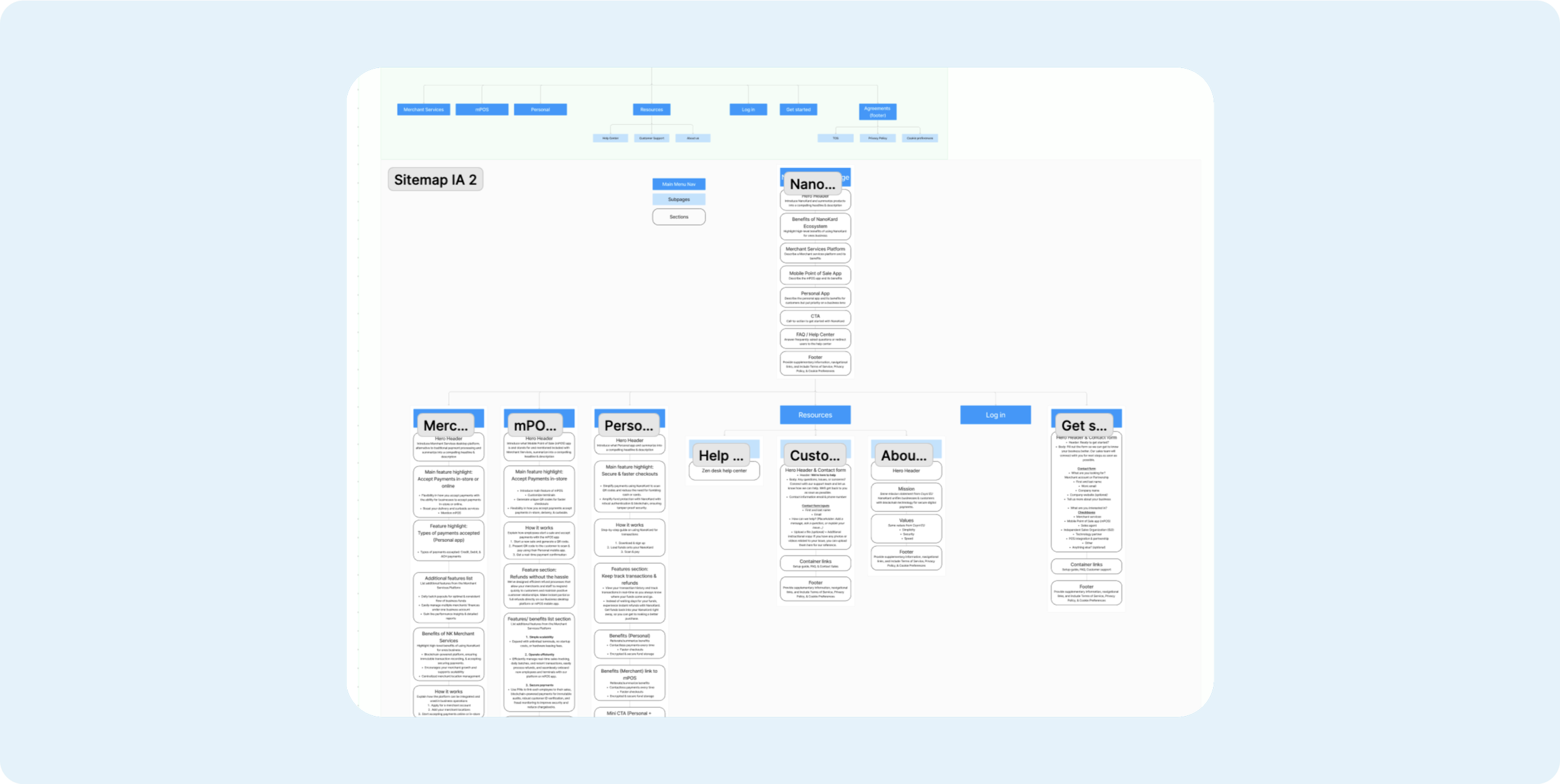
Based on the information I gathered, I worked shopped the website’s information architecture and then created a sitemap of potential content we could present within each page to present to stakeholders and gather feedback.
Iterations & testing
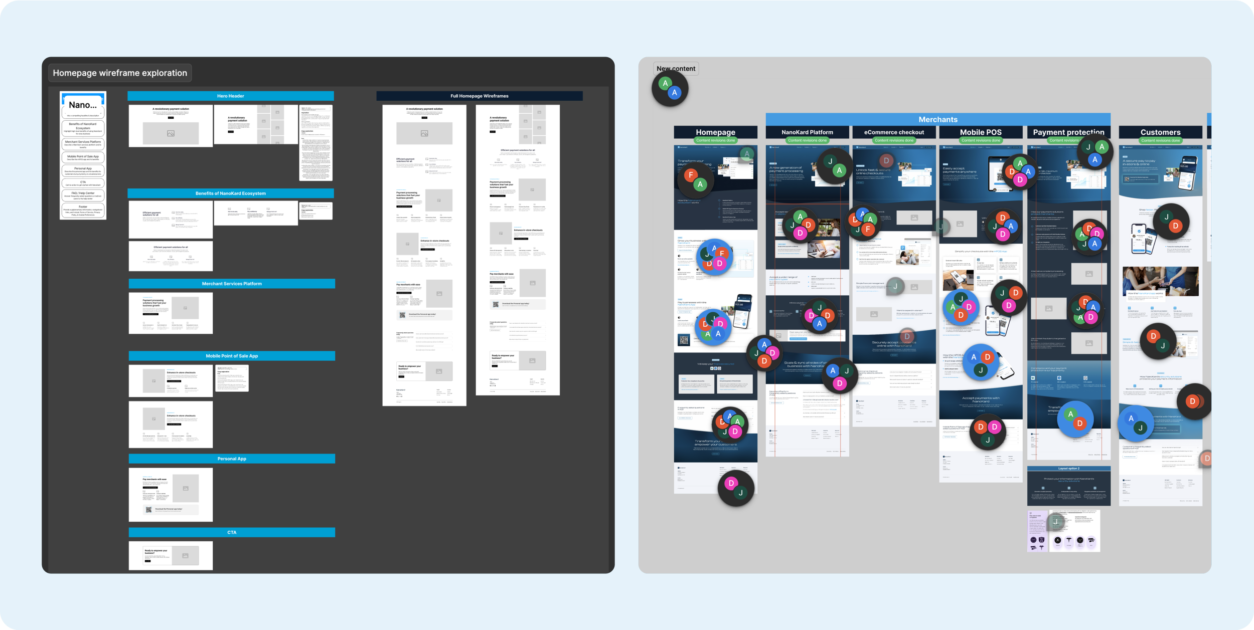
I drafted content within a notion document for each page based on the approved sitemap. Then, I was tasked to create low-fidelity wireframes and integrate preliminary content for review with Designers and Stakeholders.
This is some of the feedback that was gathered:
Add more focus on payment protection for businesses and customers.
From the VP, Designers, & Developers were to simplify content to be even more concise, meet deadline requirements, and simplify production.
Solutions
It was of huge importance that security and payment protection was emphasized to both business and customer users, therefore I pitched that we should have a payment protection page focusing on our security features and compliance certifications to assure users and potential new users of NanoKard’s safety.
Since the business goal was to put more focus on our Business Audience, it was decided to simplify the customer pages from 3 to 1 and keep all 3 pages for Businesses.
The results
Explore the full website at: nanokard.com
Successfully launched the website, ensuring that all features and content functioned as intended and were well received by leadership.
Received great feedback from the Sales team, helping them to communicate and gain attention from new business partnerships.
Decreased customer service calls for understanding how to set up and use products.


